Wine Brand Design
IIllustration | Branding
This project was developed as part of a university assignment under the theme “Beverage or Food”. The goal was to create a visual branding concept – either for a single dish, a specific drink, or for something broader like a restaurant or a food festival. I chose to develop a branding concept for a Greek wine brand that specializes in unique fruit-based wines.
Category: Semester Project
Course: Form and Composition
Year: 2022
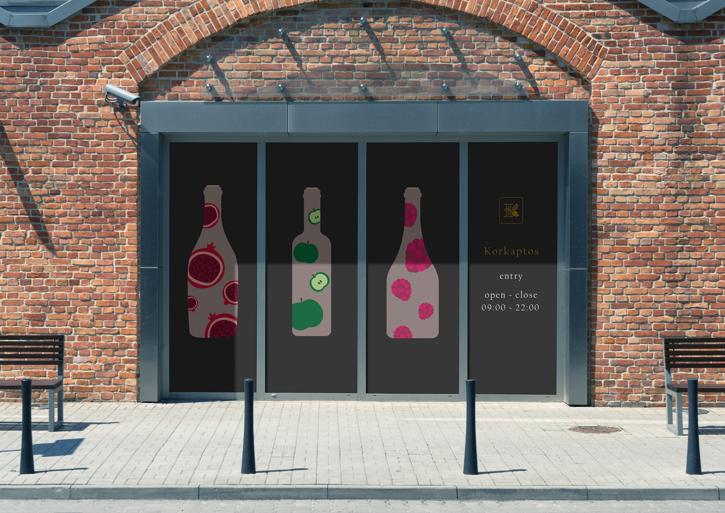
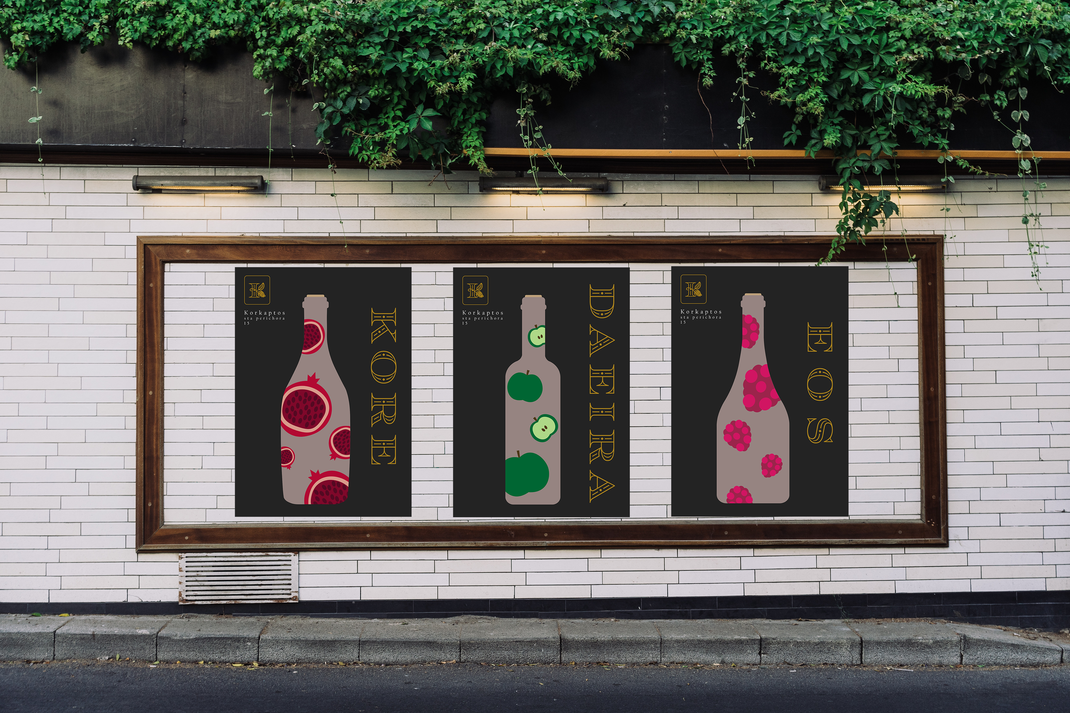
The Wine Collection
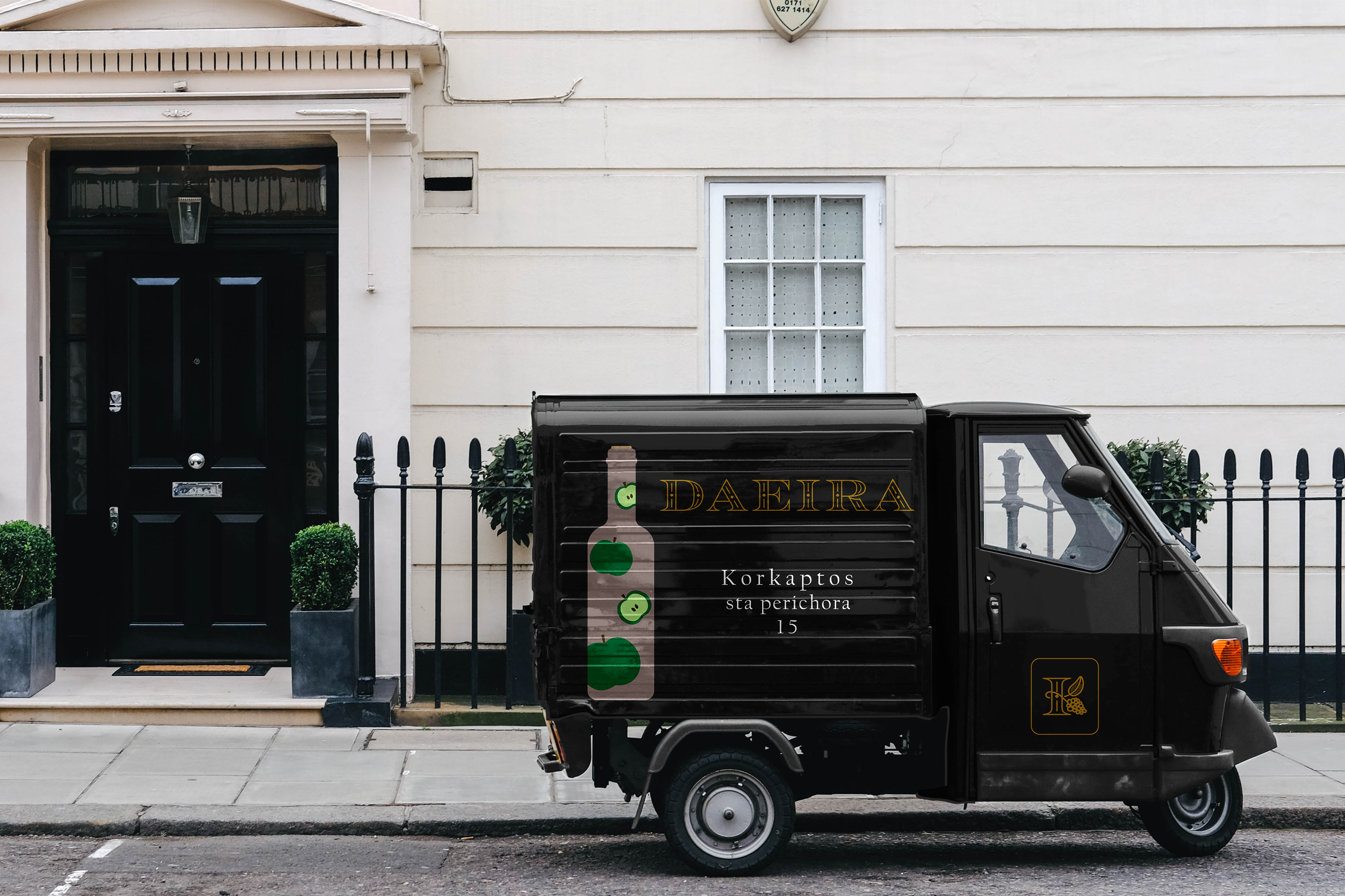
The poster series centers around three distinct wine types: red, white, and rosé – each inspired by a Greek goddess and a corresponding fruit. The red wine is a rich pomegranate variety dedicated to Persephone, also known as Kore. The white wine draws inspiration from Demeter, in her aspect as Daeira, and is based on crisp apple flavors. Finally, the rosé wine honors Eos, the radiant goddess of dawn, capturing her essence in both color and character.
The Brand
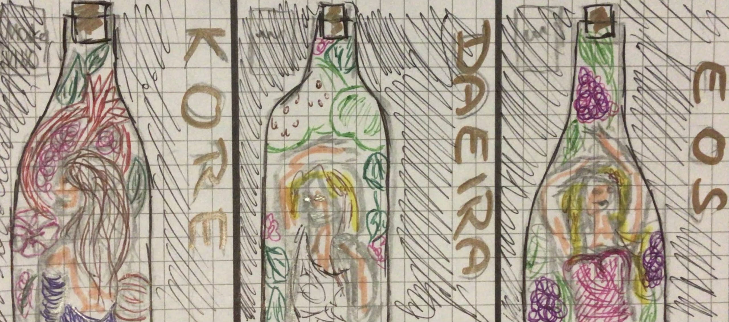
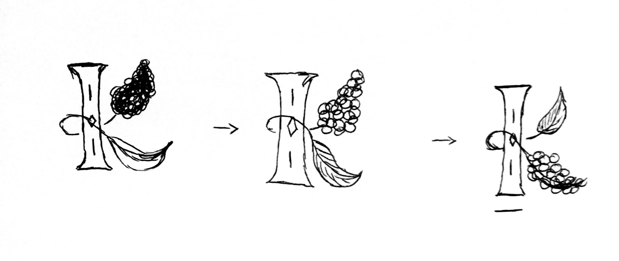
The name of the brand, Korkaptos, is derived from two Greek roots: Kore (referring to Persephone) and Kaptos (meaning "fruit"). Together, they form the phrase: “Kore’s Fruit”. The logo features the letter K combined with graphical elements like grapes and a vine leaf, creating a visual identity that feels both classical and modern.
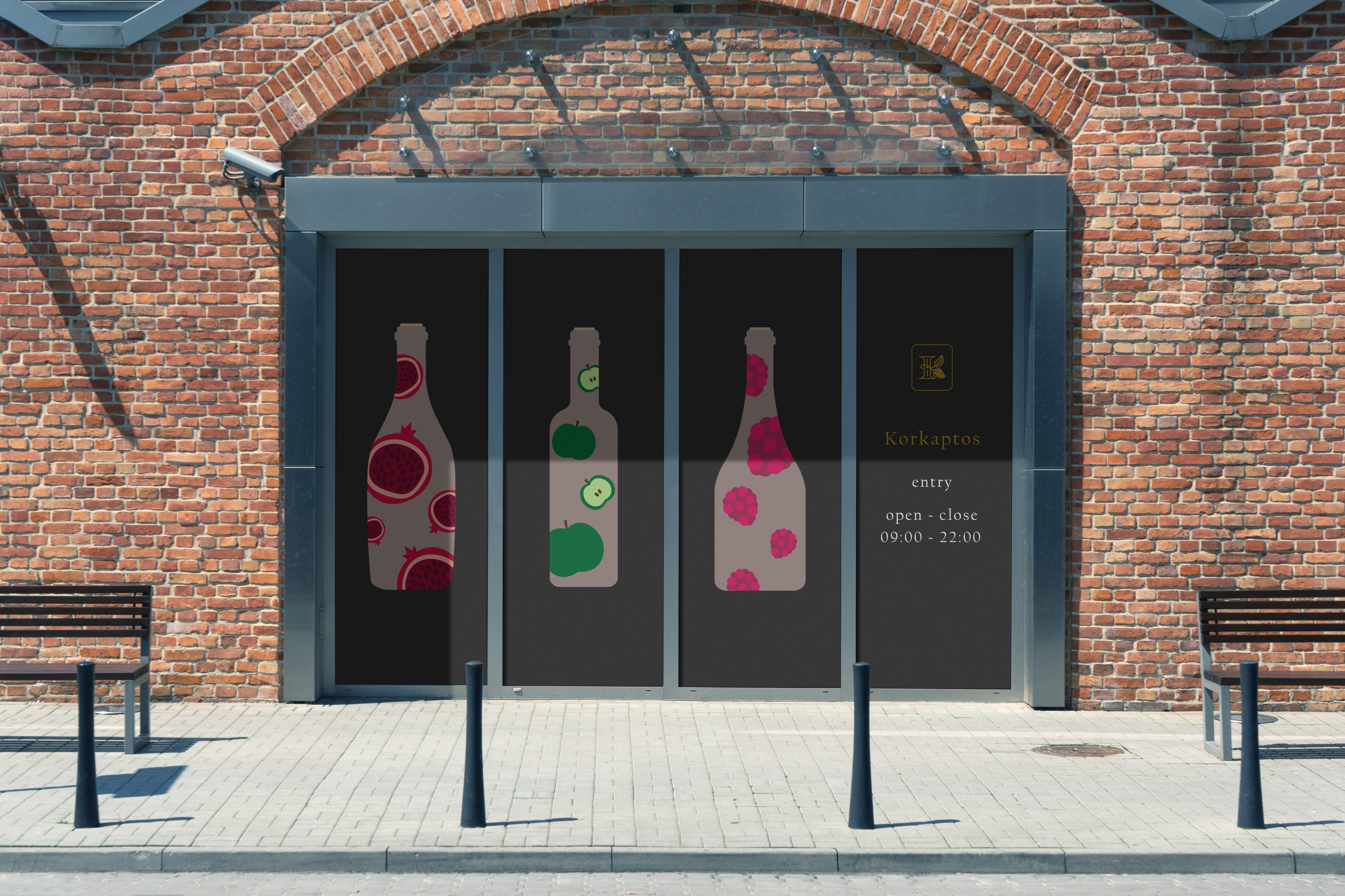
The Storefront
The winery's storefront, as visualized in the design, uses the posters as large-scale exterior displays. Their vibrant colors and unusual fruit pairings catch attention and spark curiosity. The brick façade adds a sense of tradition, which contrasts effectively with the clean, bold look of the posters.
The Piaggio
Small Piaggio vehicles are used for local deliveries – perfect for a boutique winery. Branded with the bottle designs, they function as mobile advertising that reflects the brand’s charm and accessibility.
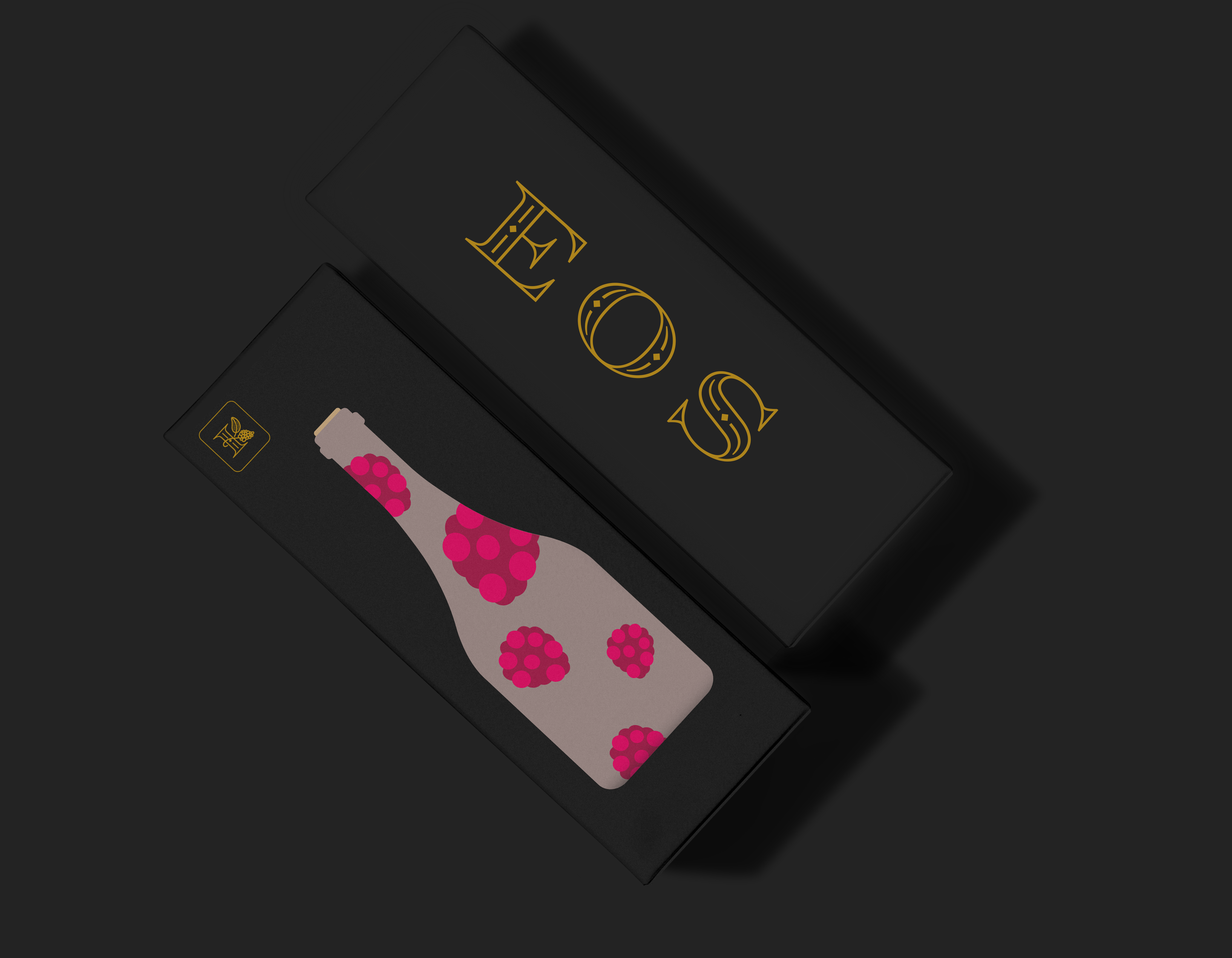
The Packaging
The posters also serve as visual elements on the packaging boxes. Since the box format is narrower than the posters, the brand name is placed on the side, while all other information is printed on the back. To give customers a better sense of scale, a true-to-size wine bottle silhouette is printed on the front of the box – practical and visually appealing.
Arbeiten
Album Cover ReDesignIllustration | Branding
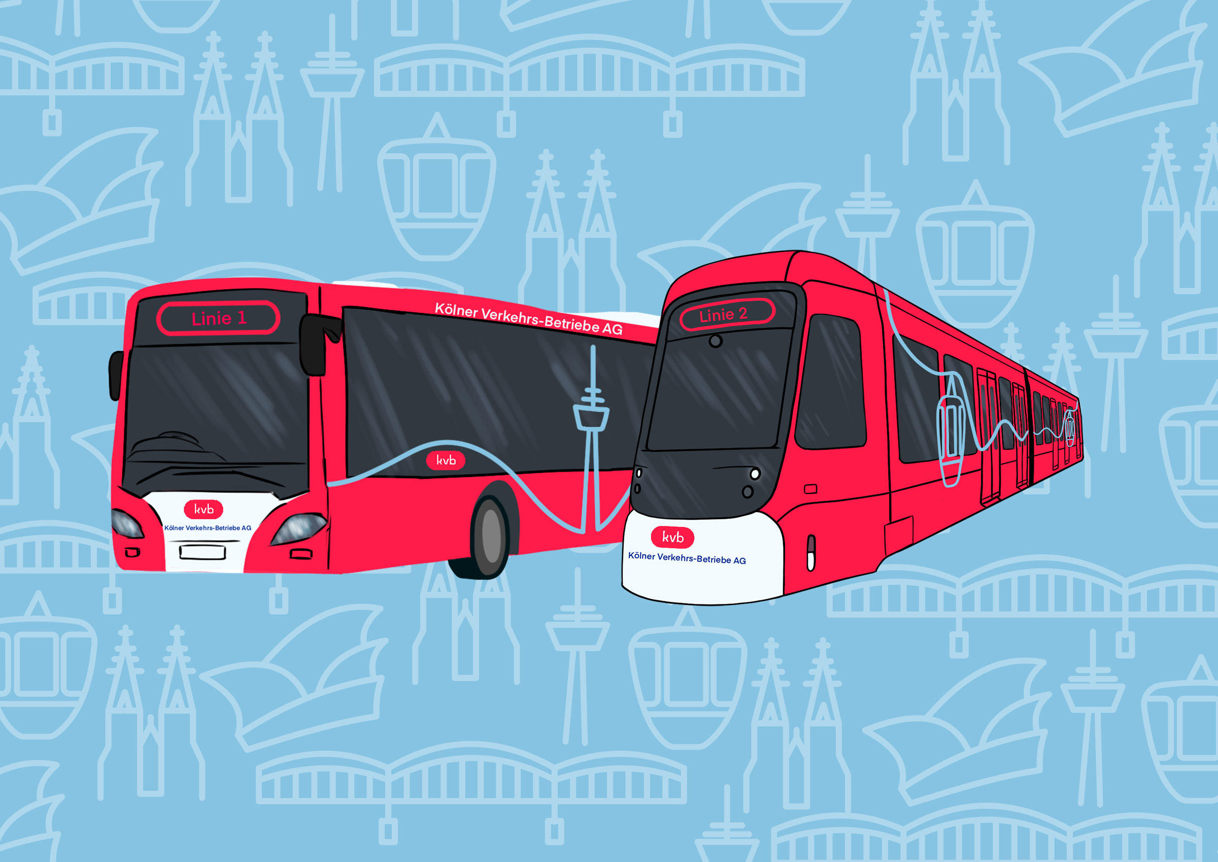
KVB ReDesignIllustration | Branding
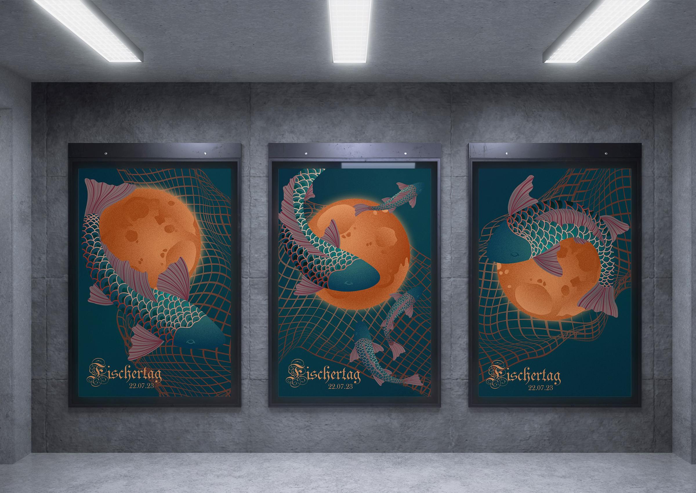
Fischertag Poster DesignIllustration | Branding
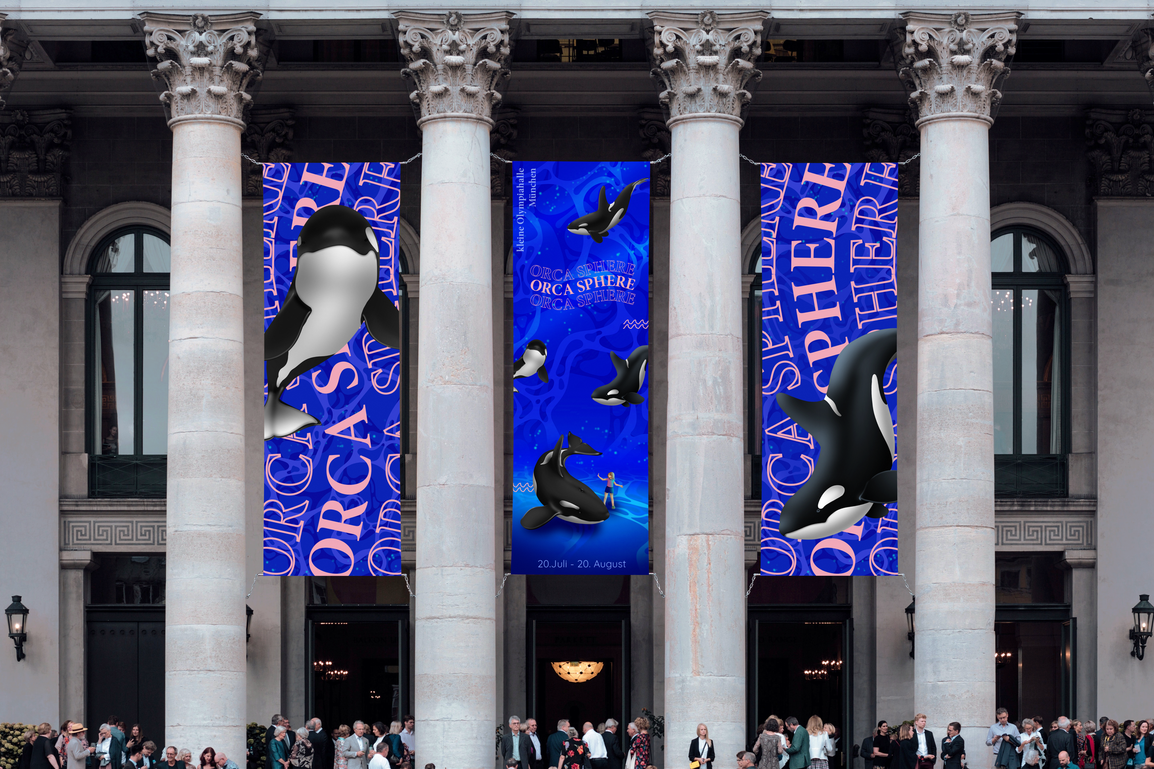
ORCA SPHEREIllustration | Branding
Wine BrandIllustration | Branding
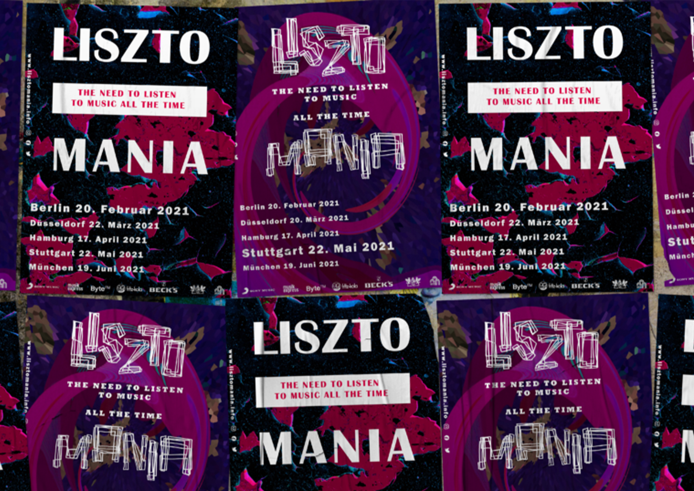
Playfull Typography PosterPoster Design